Chegg Brand Refresh
Role: Art Direction, Visual Design,
Illustration & Icon Design
Authenticity as northstar
In collaboration with the Creative Director, I played a pivotal role in reshaping Chegg's brand to be more authentic and better suited for today’s students.
The foundation for refreshing Chegg, a leading education software platform serving millions of students, came from recognizing the need for a shift towards grounded and elevated visuals that authentically capture the passion of real-world students.

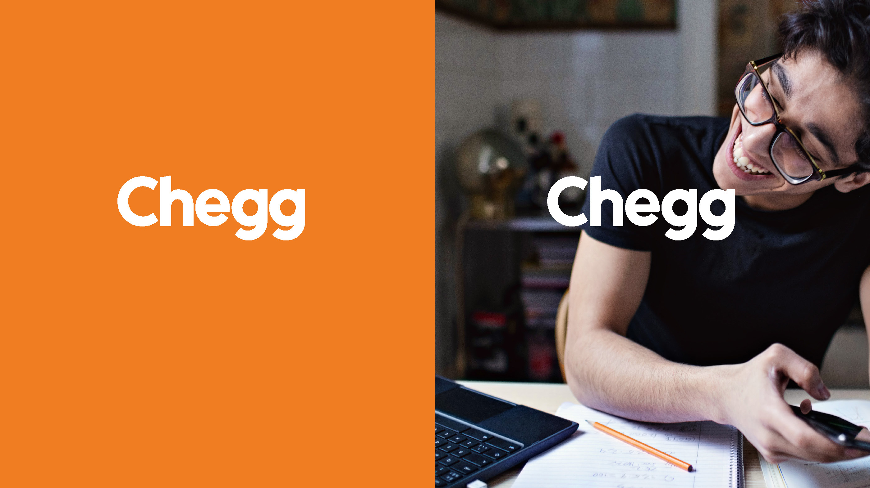
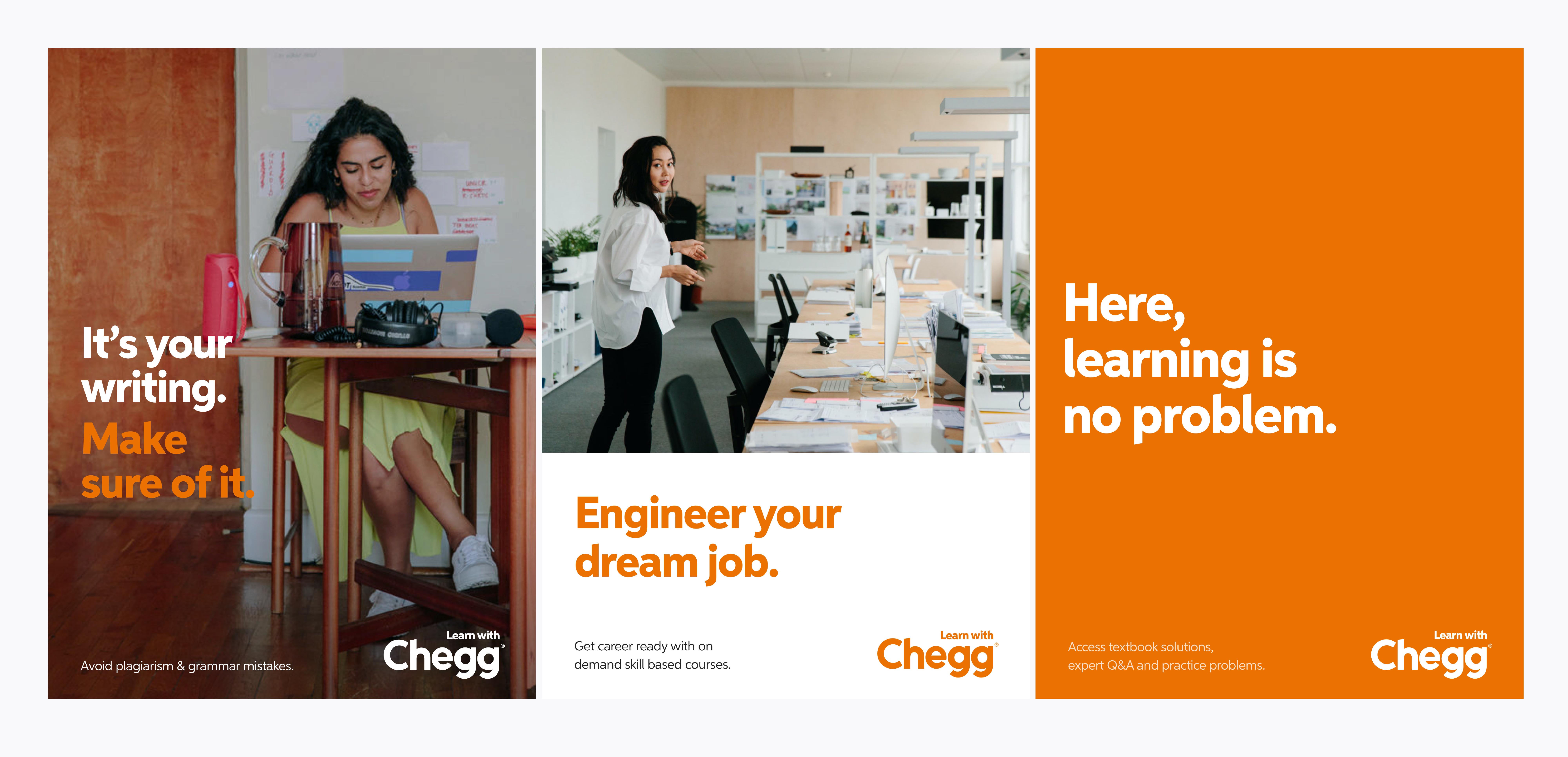
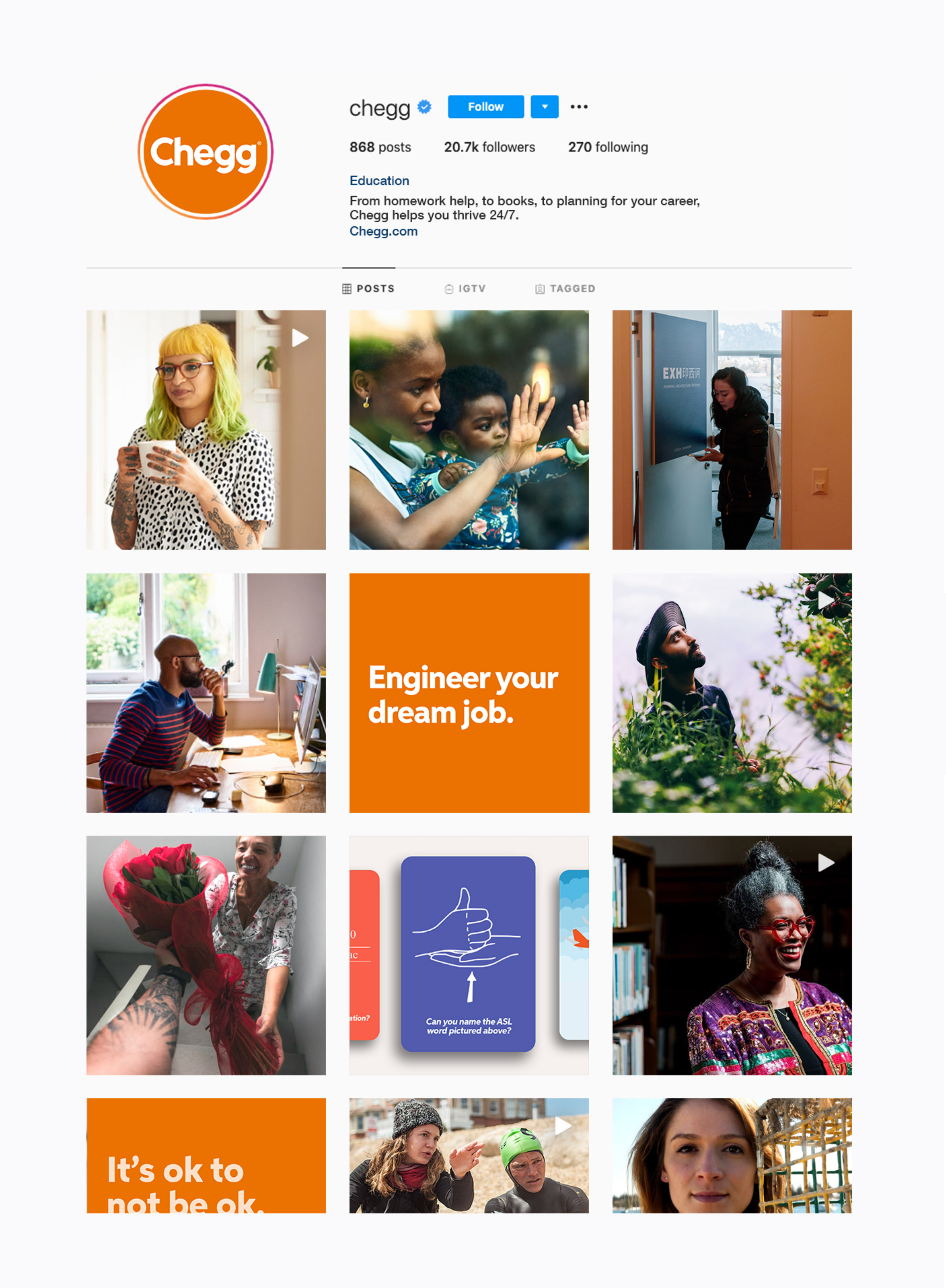
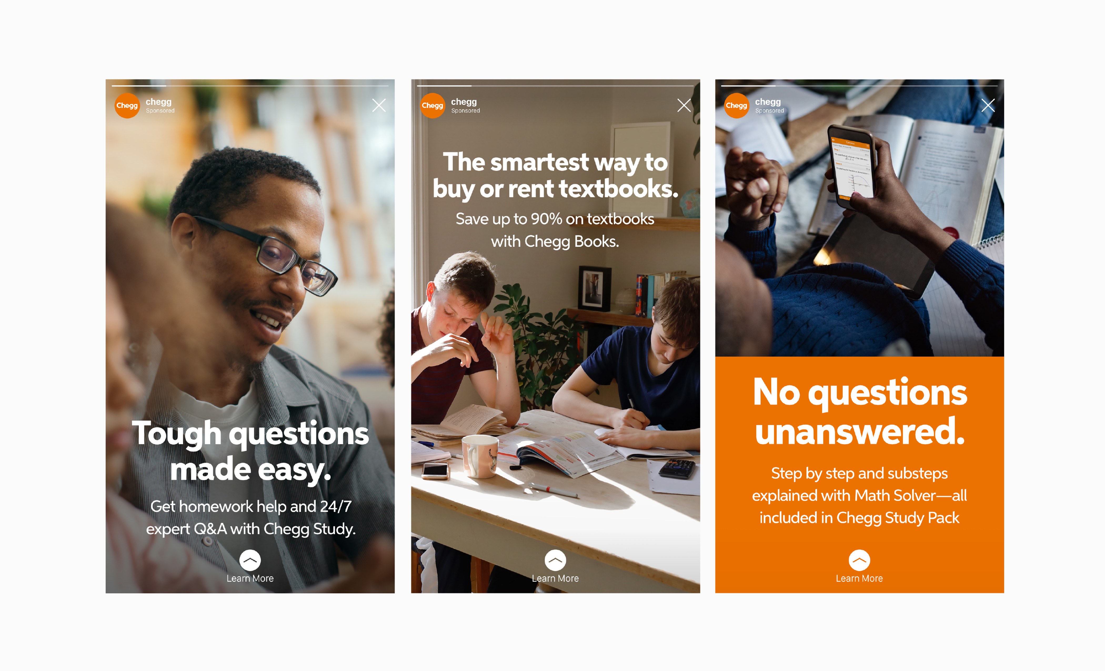
A brand grounded in the real world.
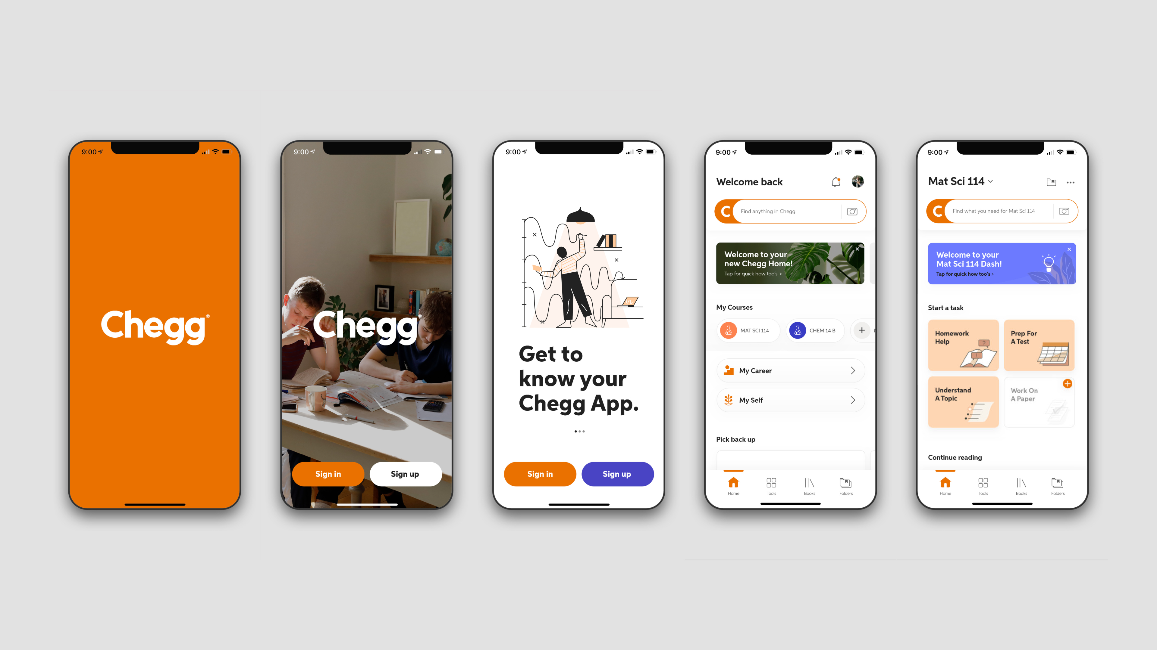
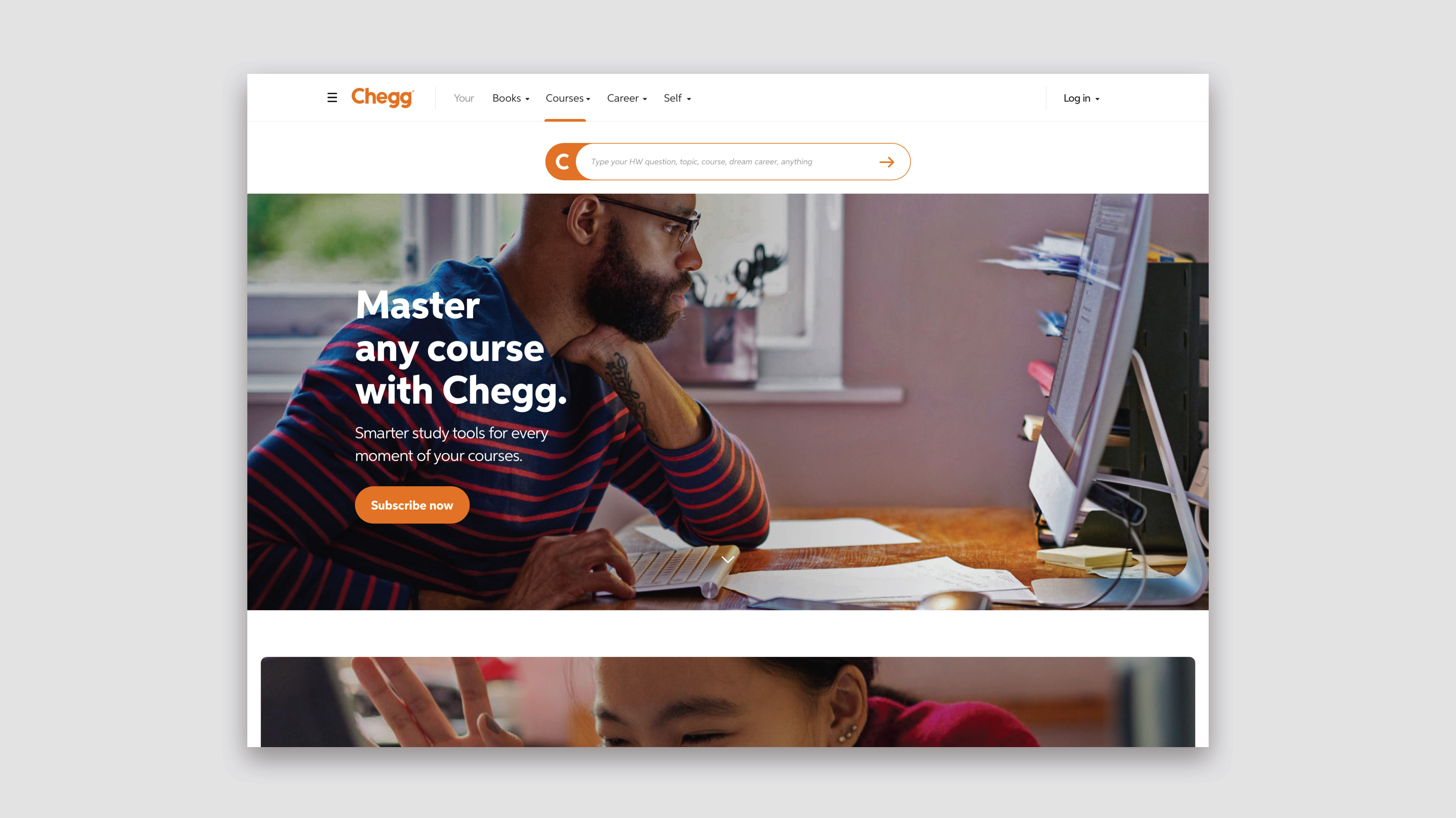
To align the brand with the reality of what students live every day the visual language contained an emphasis on authentic and warm photography paired with selective use of brand colors.
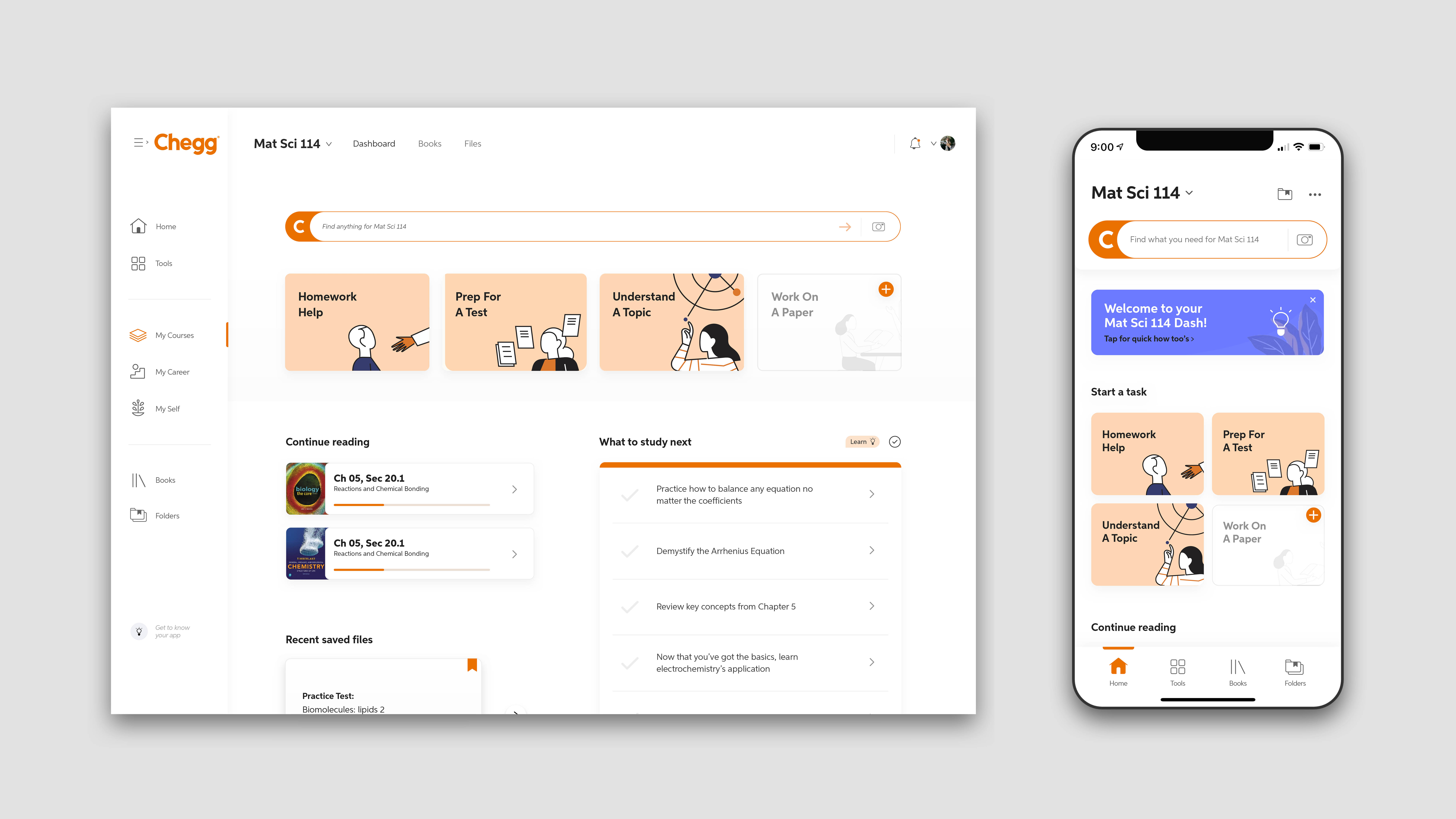
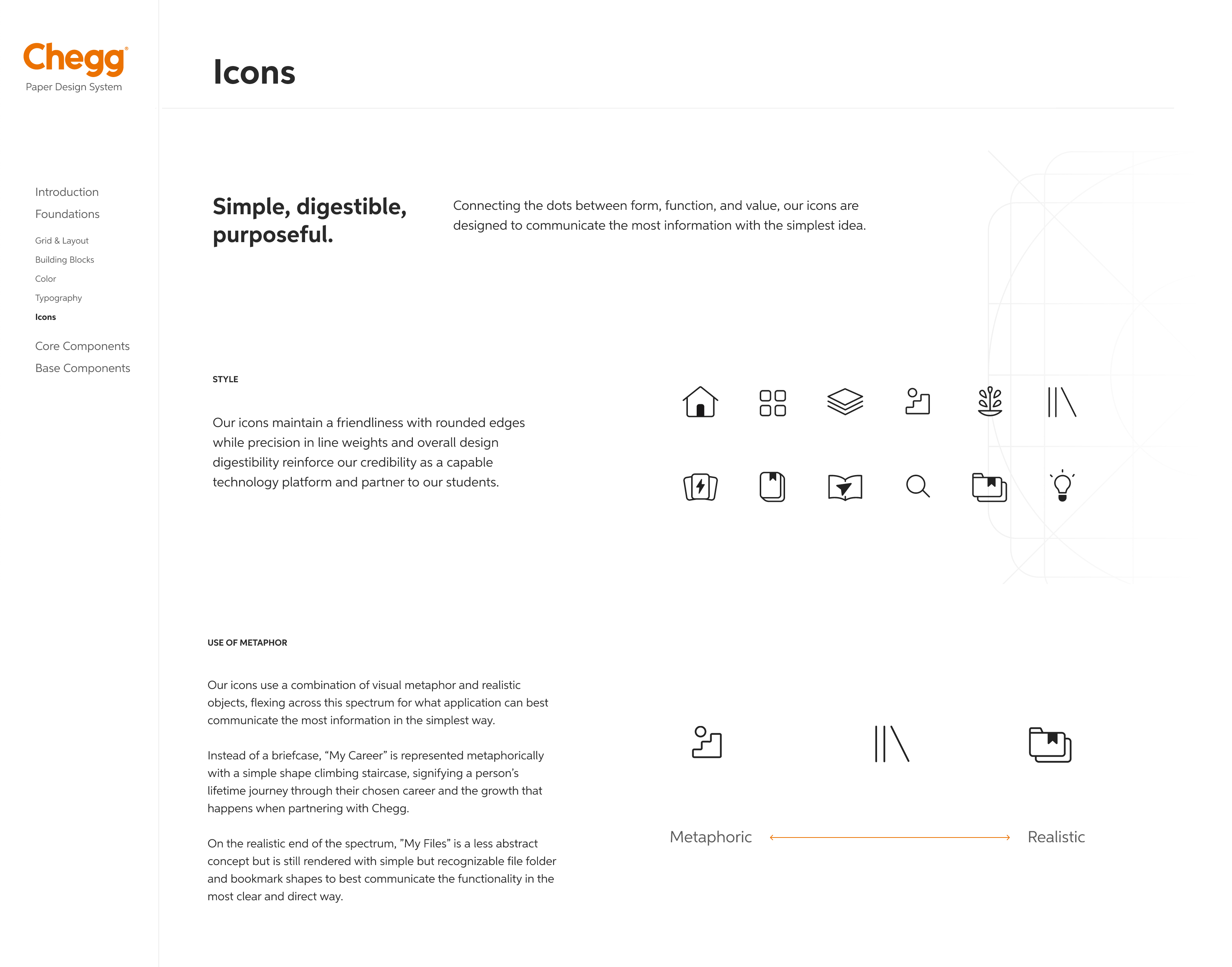
The use of warm and authentic photography extends into digital product moments with icons for easy wayfinding around the app.
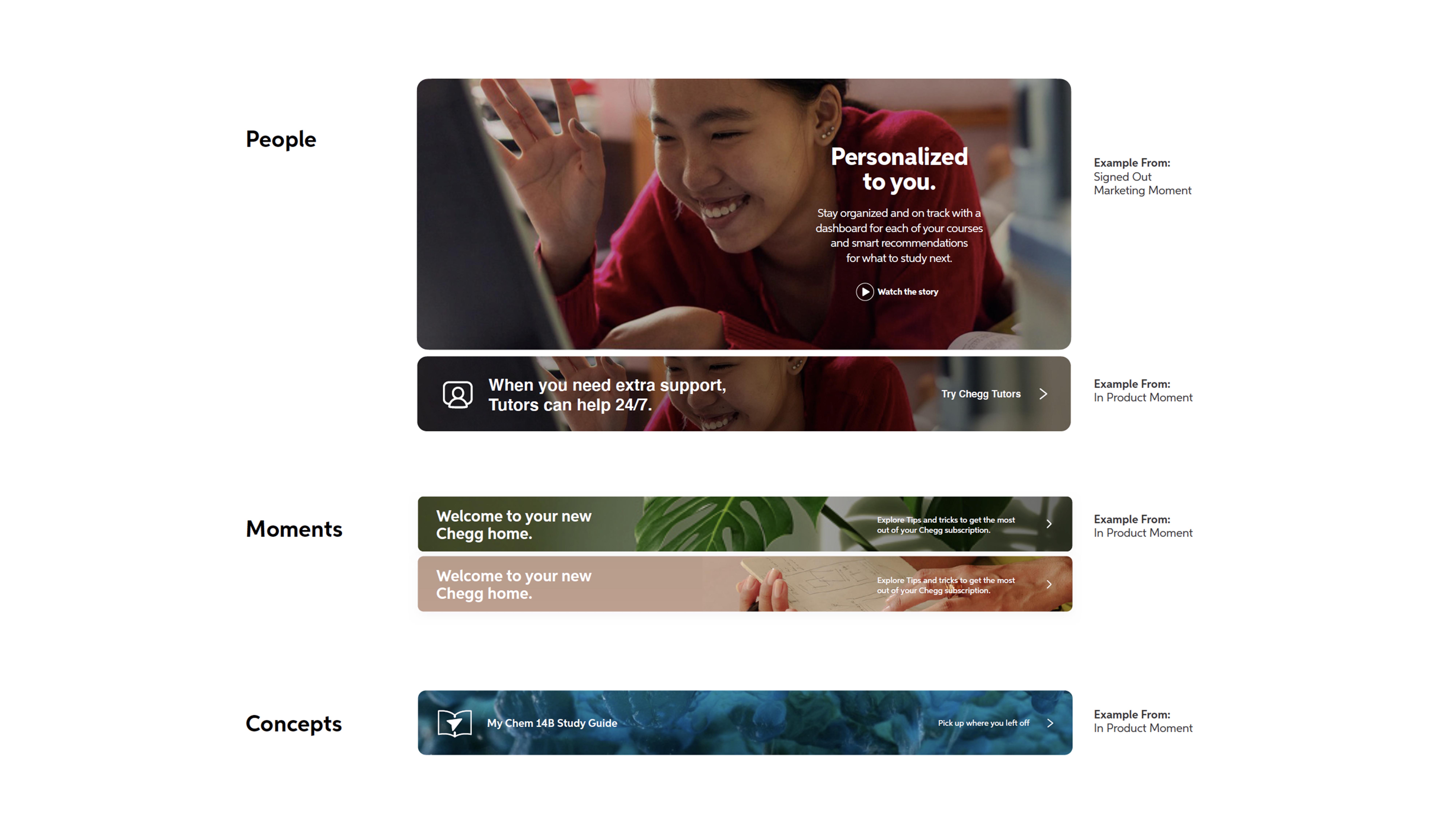
A branded search bar helps guide students when they land on main pages, providing a consistent and trusted point of assistance

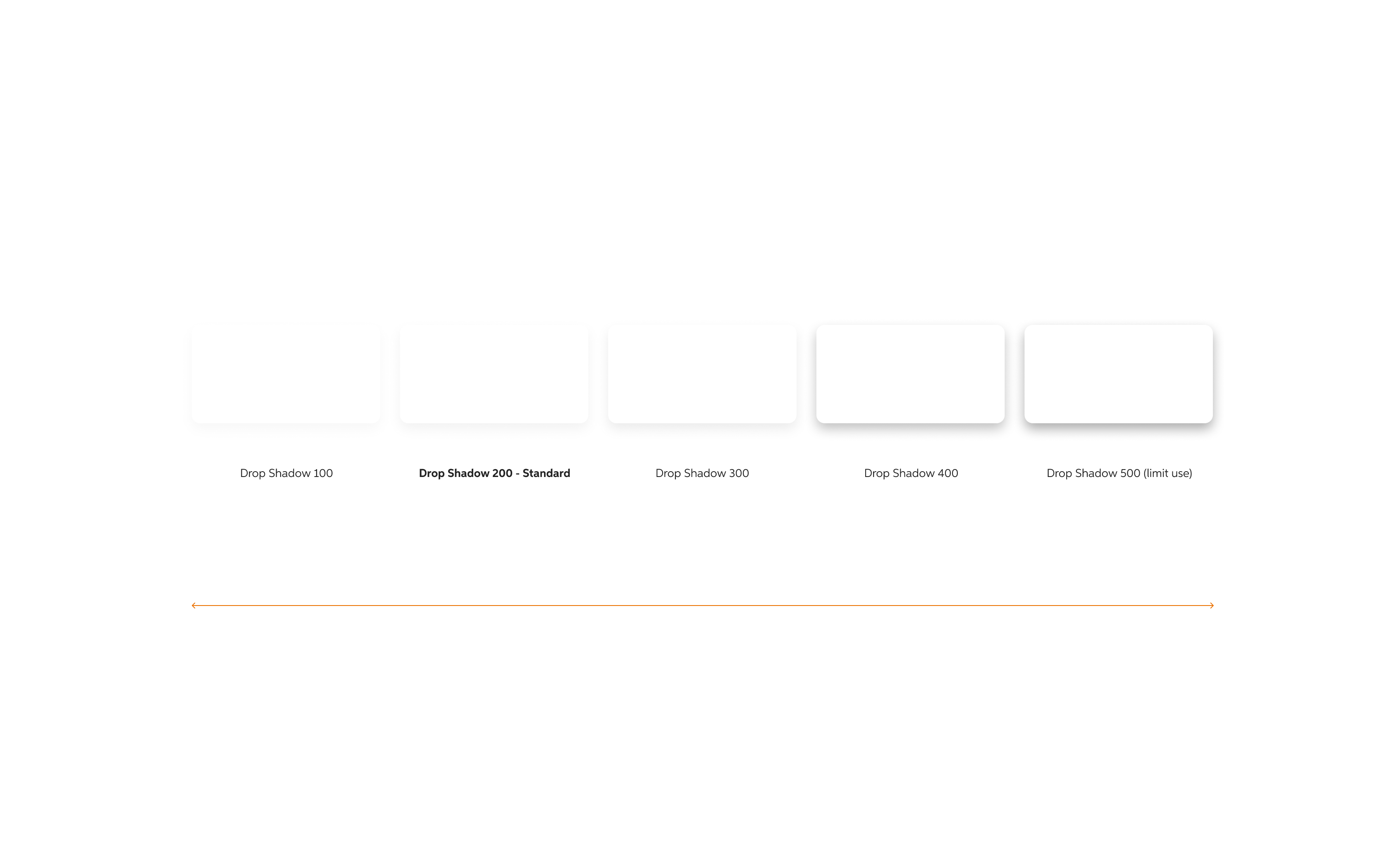
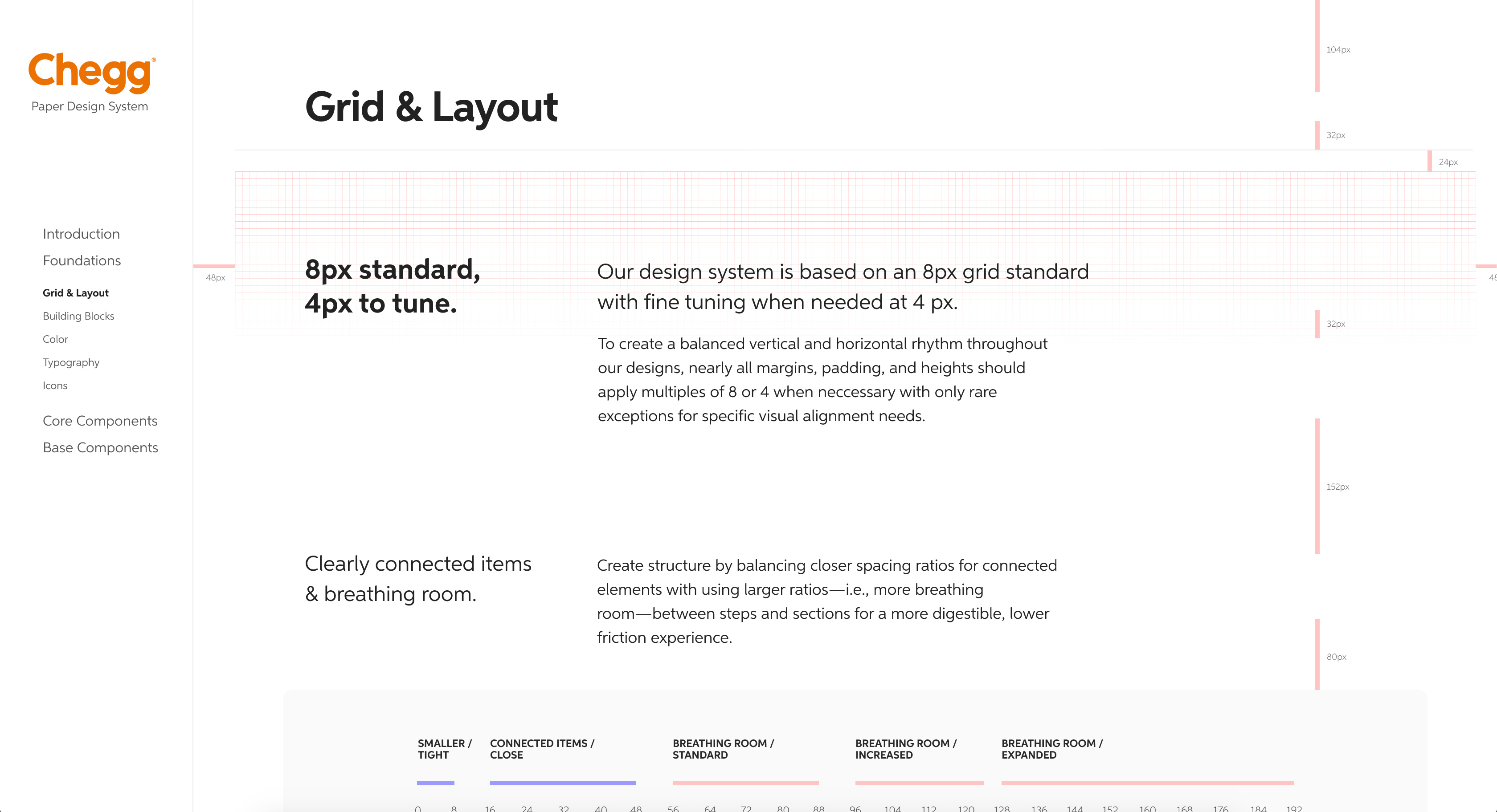
Design System
To flex the core brand across digital spaces, a design system was needed. Chegg’s design system is based on a generous use of whitespace, clear typography, warm illustrations, and selective use of color that allows the UI to feel organized and inviting.
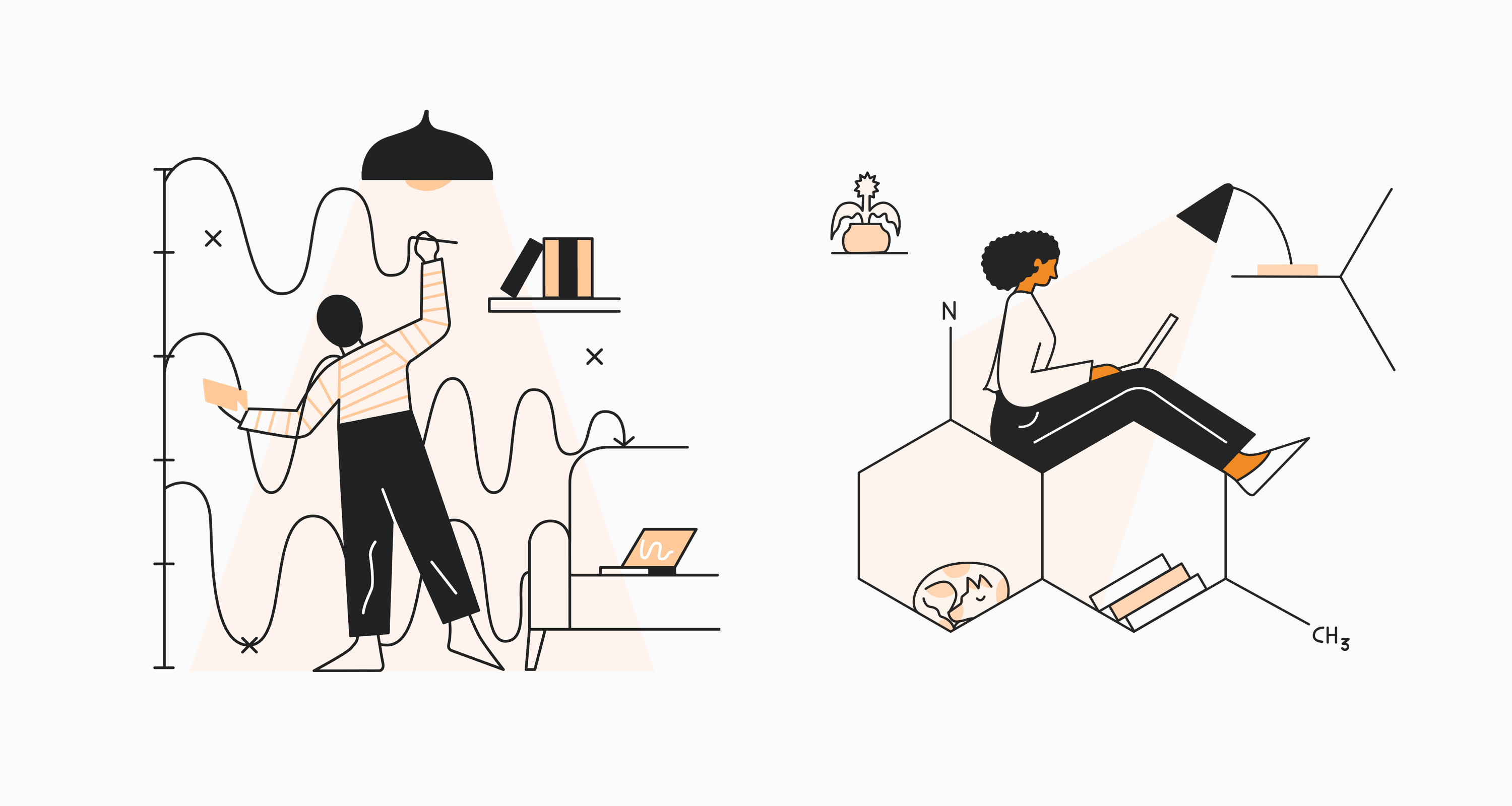
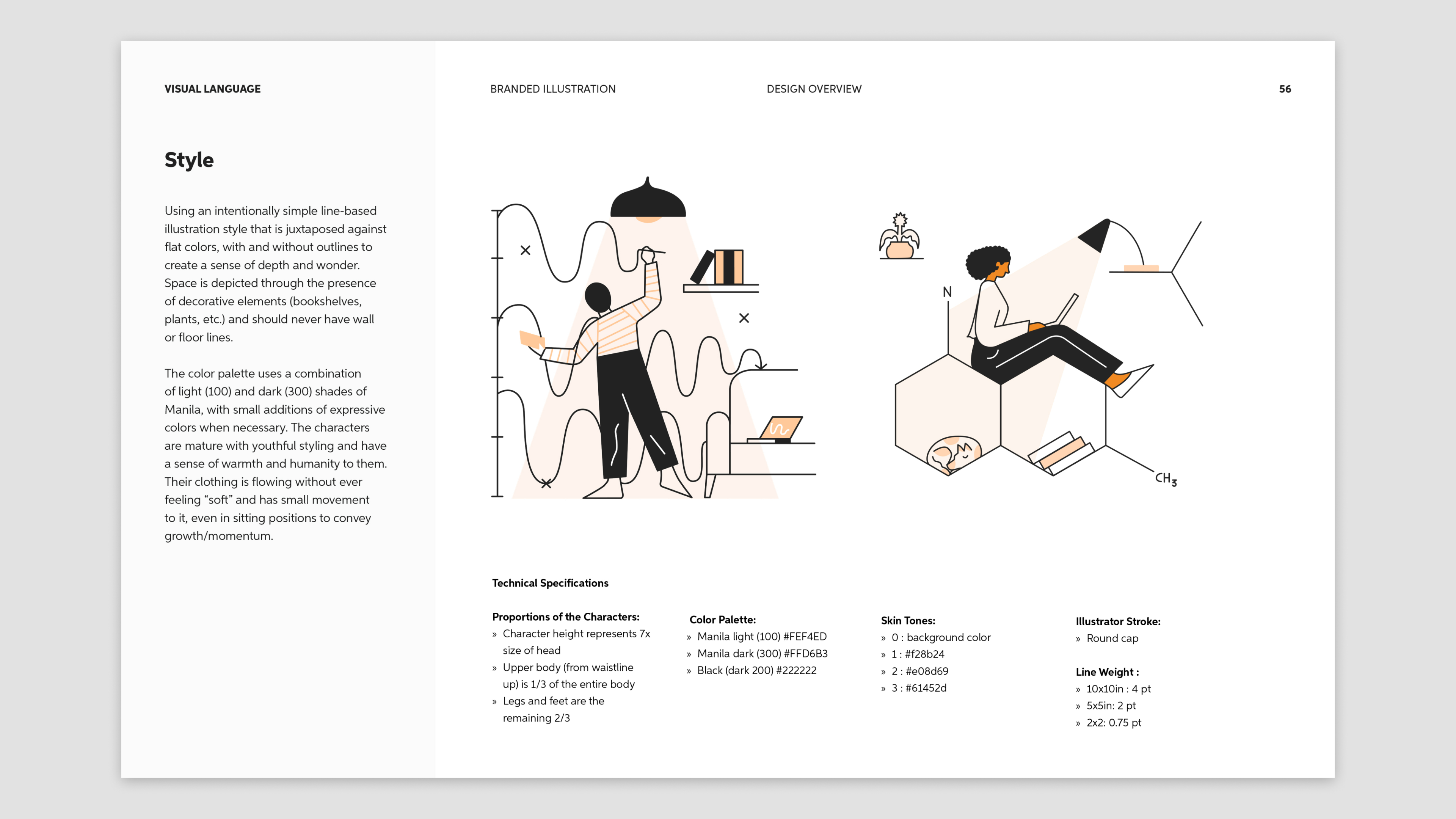
Illustrations
To balance out using brand photography and icons in the Chegg app, I developed an approachable branded illustration style.
The style ensures a grounded sense of realness by giving the character’s clothing and surroundings a relateable simplifed nature.